The Most Important Table Calculations In Tableau from Coding compiler. Here are 10 useful examples of Tableau table calculations. Most of the time in table calculations writing a simple formula can solve the issue and gives the result in desired format. Each table calculation example includes a live example and instructions in a tabbed view. You can also download all workbooks if you would like more information. Happy tableau learning.!
Table Calculation in Tableau Tutorial
You need Tableau Desktop if you want to view or recreate these spreadsheets. Get a free 14-day trial here .
Table Calculation in Tableau Basics
Table calculations are based on two types of fields: addressing and partitioning fields. It’s important to understand how these fields work to understand spreadsheet calculations.
As the name implies, partitioning fields are used to partition your data into separate groups for which calculations are made.
Addressing fields specify the “direction” that your calculation should take.
In the example on the right, the current total of sales is determined. The segment is a partitioning field. Therefore, a running total is calculated for both segments – consumers and businesses. The date is the addressing field. Sales are thus calculated for both segments over a period of time.
1. Percent change from a reference date
With table calculations, you can calculate the percentage change from any value. For example, suppose you are interested in a securities portfolio and you want to evaluate its relative performance from a specific point in time. To do this, set an “investment date” and normalize the values to the same time. The lines indicate the percentage change. You can adjust the reference date using the slider.

By using a parameter for the reference date and the WINDOW_MAX function to retrieve the closing price for the reference date, you can calculate the relative return of the stocks.
2. Same output data (Toy Story)
You may want to look at the data in relation to a common baseline, rather than over an absolute timeline. For example, here are the box office scores of the three Toy Story movies. It’s much easier to make a comparison if you look at the gross earnings by week from theatrical release:
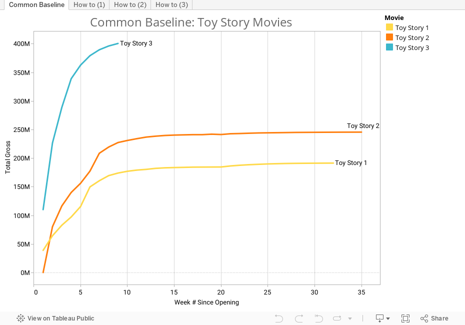
Tableau’s INDEX () function makes it easy to calculate the number of weeks since the movie was released: in this case, partition by movie and address by day.
3. Percent of total sales over time (multi-pass aggregation)
Often, two table calculations should be performed at once. For example, it may be of interest how the segment’s importance to the business has grown or decreased over time. To do this, you must first calculate the running total of sales by segment over time. Then you have to look at this result as a percentage of all sales over time. This is called multi-pass aggregation, and no formula needs to be created in Tableau.
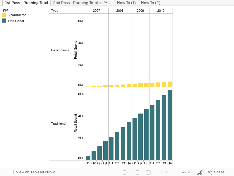
First, a running total of sales is calculated over time by segment. Then, the running total of each segment is calculated over time as a percentage.
4. Maintaining the sorting ranking
In this case, we want to determine the rank of a product within a month and a year and then show how its ranking has evolved over a period of time. To do this, we create a bump chart that shows the change over a period of time as a line chart. On the left we see that copiers and fax machines were only rarely sold, but are now ranked third in terms of sales. We can also read that the sales of fax machines and copiers were very volatile.
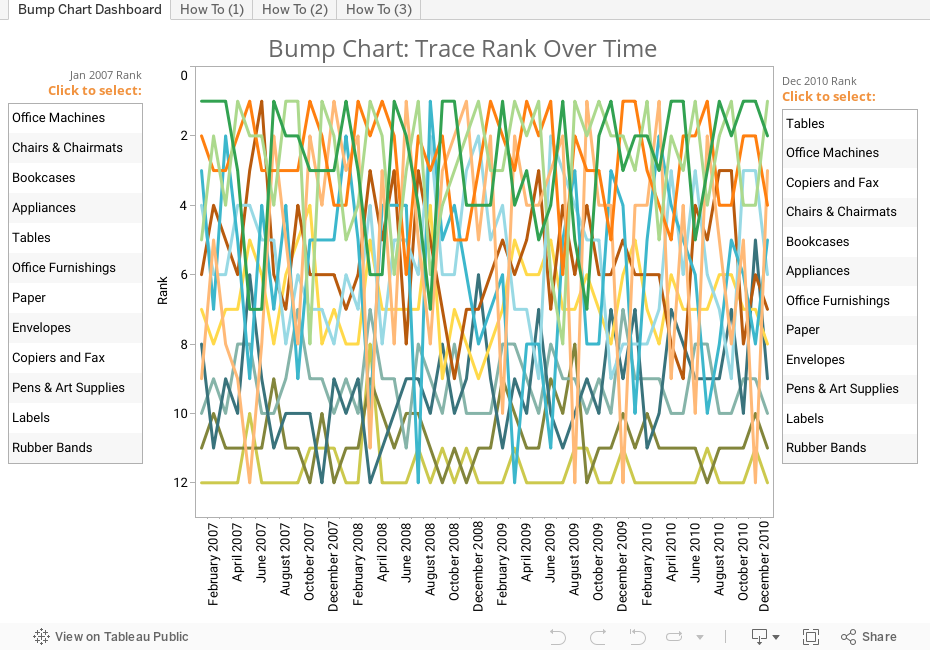
Classic Bump Chart It shows the sales position of each product, which was determined by a simple ranking calculation (index ()) and some advanced settings.
5. Running sum
You want to monitor the number of active support cases in your call center or your inventory. However, the system does not calculate the running total of active cases, and you must derive them. This corresponds to the following equation: Open cases in one day + New cases + Reopened cases – Closed cases.
At first glance, this looks like a simple calculation. However, the open cases rank for one day is derived from the previous day’s completion, which in turn is derived from the open cases of that day. This results in a circular reference of the calculations.
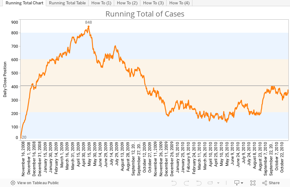
We use WINDOW_SUM to calculate the running total and to determine the completed cases per day.
6. Weighted mean
Data such as test results or order priority are suitable for weighted average analyzes. You may want to determine the average priority of all orders across different product types and weight the priority by order volume so that higher volume products receive a higher priority result. You can also use this weighted average priority result to optimize your supply chain for high-volume, high-priority products. Here we just do it using the data “Superstore Sales”:

Here we use WINDOW_SUM again to calculate a weight for each category and then apply it to the priority result.
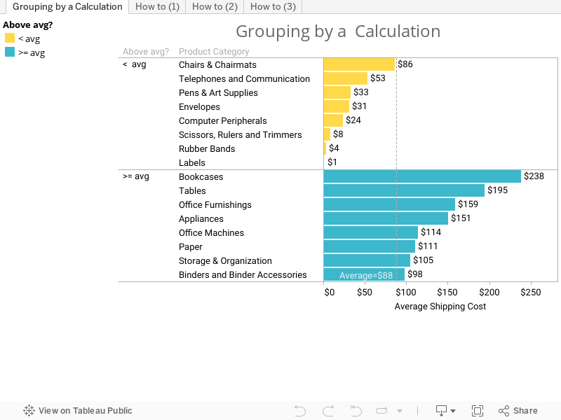
7. Group by calculation
If you manage the shipping of a business, you might want to know which products are shipping higher than the average. In Tableau 6, you can find the mean across a window and use that value in a calculation to group and color values.
8. Number of incidents over a moving range
In various scenarios, such as retail, intelligence or border control, the frequency of an event within a time frame often plays a role. For example, a suspicious event could be an anomaly. However, if this event occurs more than n times in x days, an investigation is required.
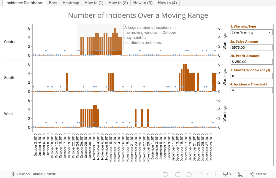
The dots show how many times warnings or alarms have been issued – usually 0. A dot above 0 indicates that a warning has been issued on that day. And a bar indicates that the alarm was triggered more than n times in x days. With a right-click, the user can view the data for the points and bars.
9. Moving average over variable periods
You calculated the moving average of all month sales using the Quick Table Calculation feature in Tableau. Now you’d like to expand the mean, so you can choose how many time periods you want to average.
The light blue line shows the “SUM of” the sales of all months. The orange line shows the moving average of sales for the period “15”.

Using the combination of a parameter and a user-defined Fast Moving Table Calculation, we can average over variable time periods.
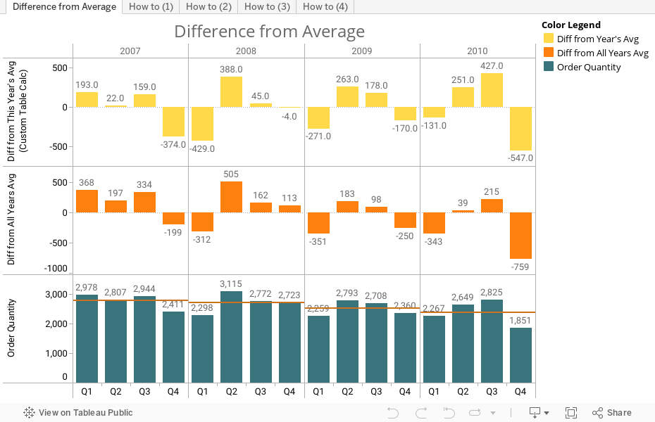
10. Difference to the mean by period
You may want to find the difference in quarterly sales at this year’s average, rather than the absolute numbers. Below we show the difference to the mean of the year and the absolute number of orders.
We hope that you enjoyed this table calculation in Tableau tutorial. If anything to discuss please drop your comments in the below comments box.
Related Tableau Interview Questions
Tableau Interview Questions And Answers
Tableau Multiple Choice Interview Questions